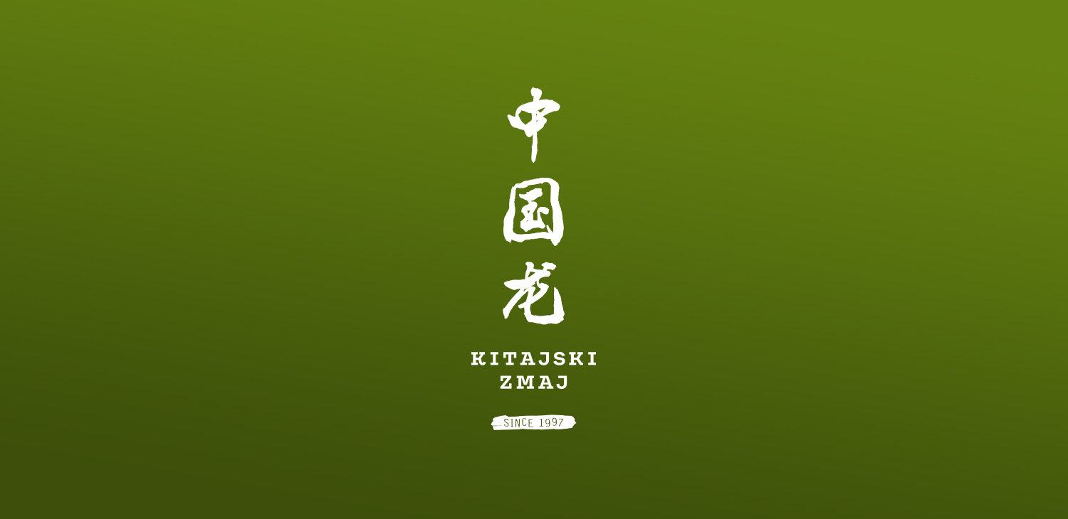
KITAJSKI ZMAJ / CHINESE DRAGON
Services: GRAPHIC DESIGN, BRANDING
Kitajski Zmaj or Chinese Dragon in English is freshly renewed Chinese restaurant owned by a young restaurateur, who took over from her uncle. She decided to spruce the place up and for some part of ‘‘the grand renovation’’, she contacted me. Mixing traditional with modern is not an easy job, but it is important to still stand out.
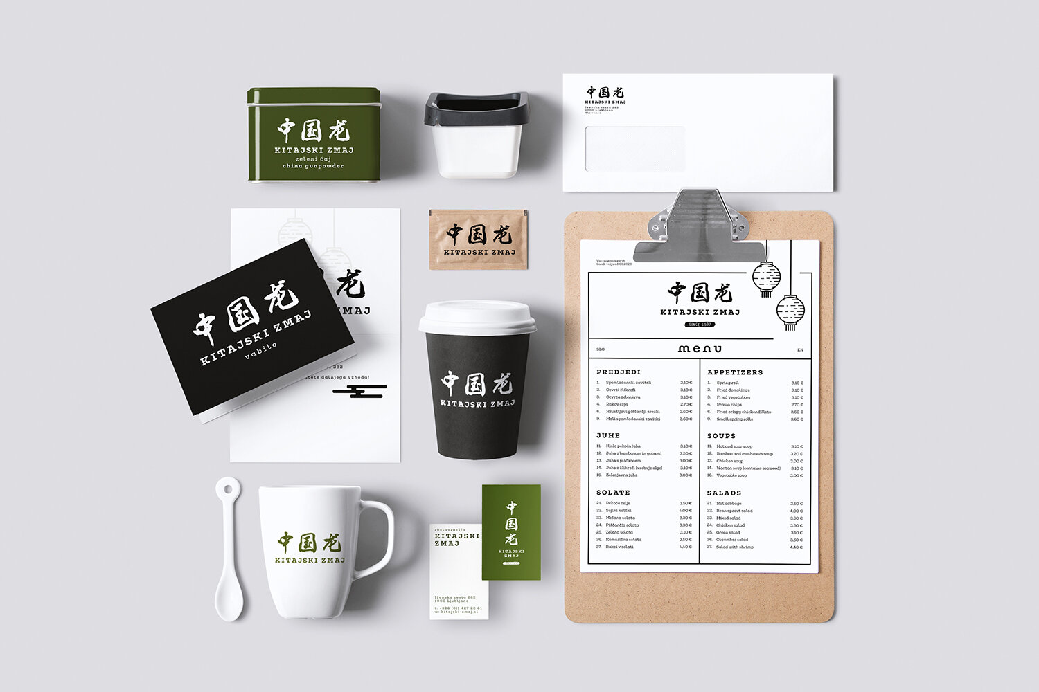
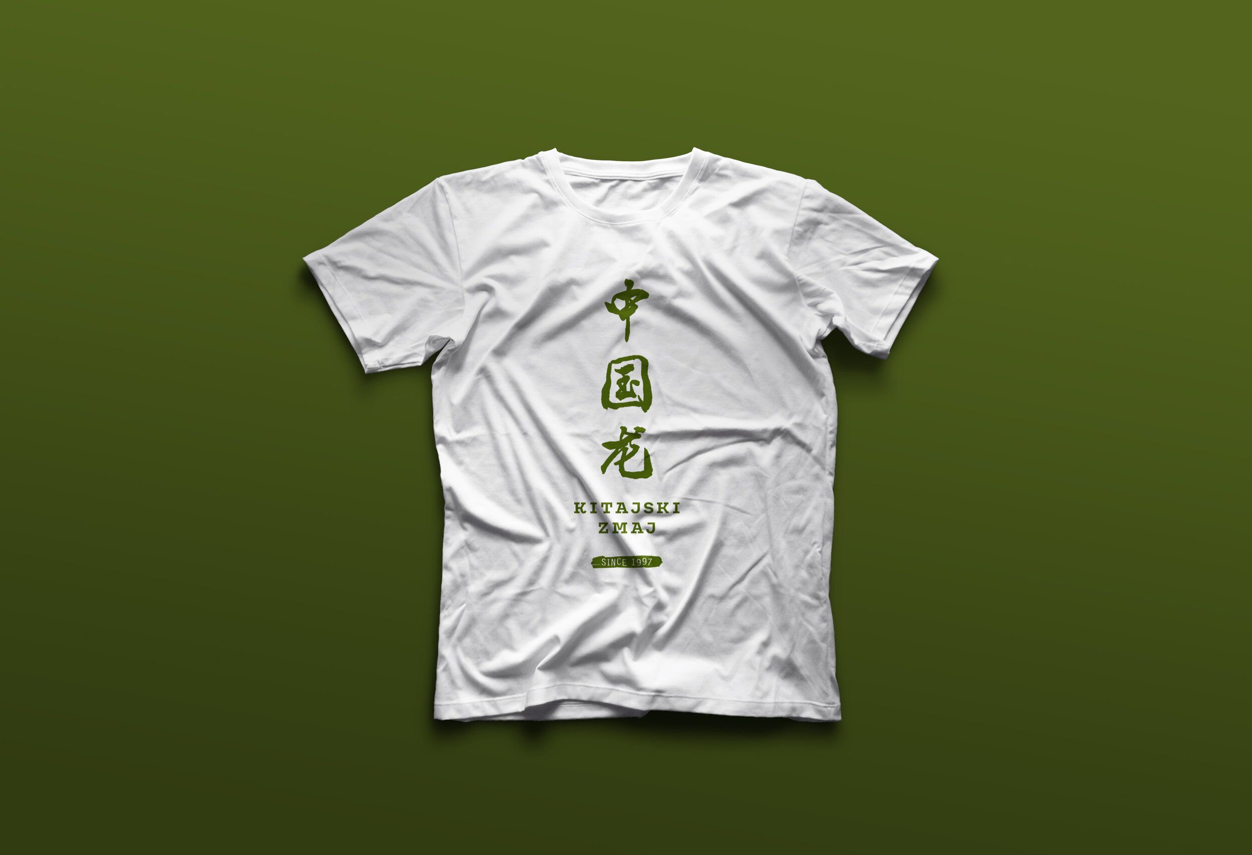
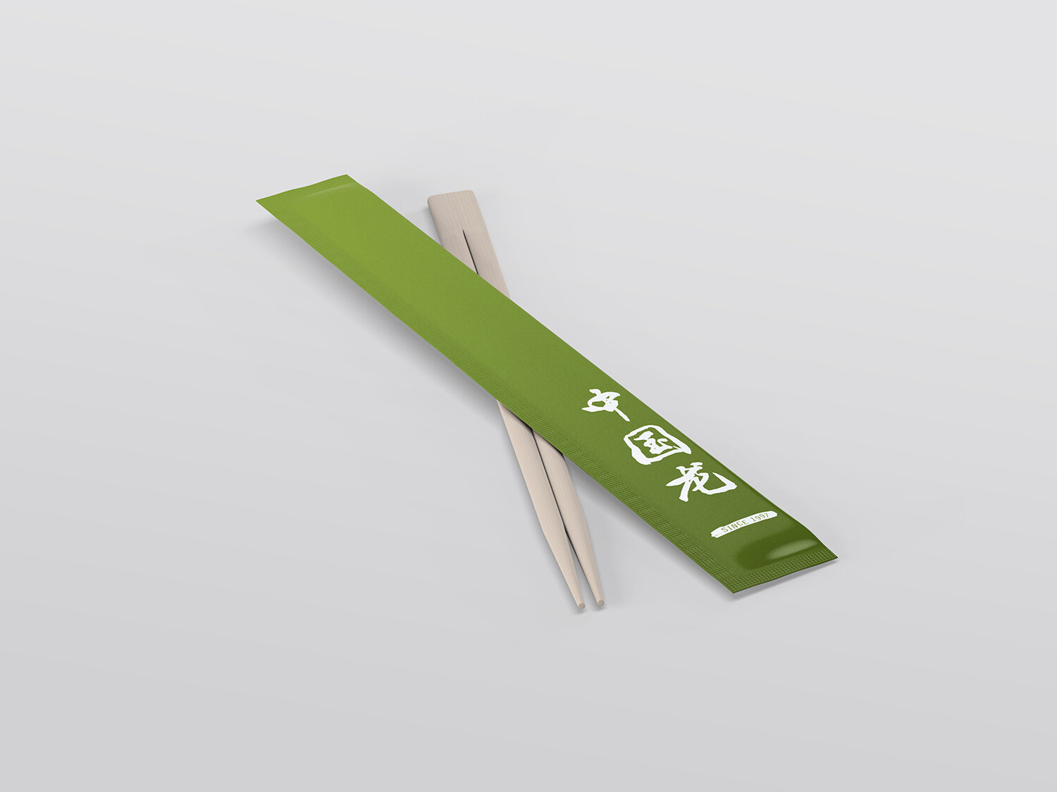
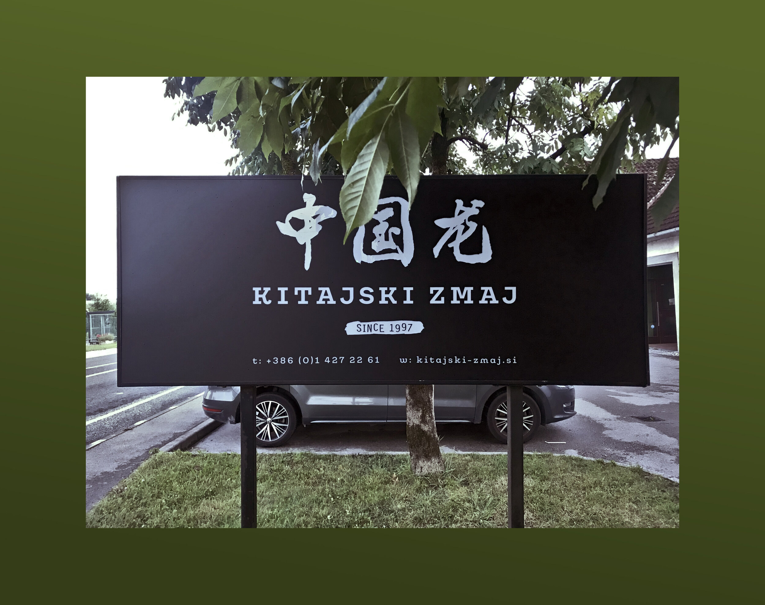
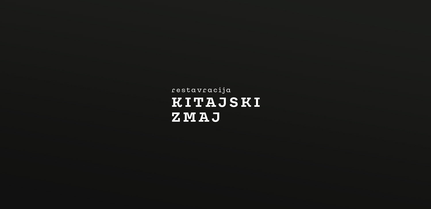
We had to ditch the classical kitsch and the all-red-everything mentality first. We went with the classic dual tone of black and white, BUT! since we already know that’s not how I roll, I offered my selection of tea leaves green as an alternative colour.
DING DING DING - Jackpot!
Aaaanyway, now we have black and white for the base and green for the alternative, but also KANJI! Kanji had to stay alive and looking at the other Chinese restaurants in greater Ljubljana area, there isn't a lot of it around. So that was another thing that helped us stand out and keep authenticity of the place in check.
Mix everything from above and add a bit of spice, know as, slab serif type aaand we are there. To see how everything turned out. please continue.
C O L O U R P A L E T T E


L O G O T Y P E V E R S I O N S

I N U S E